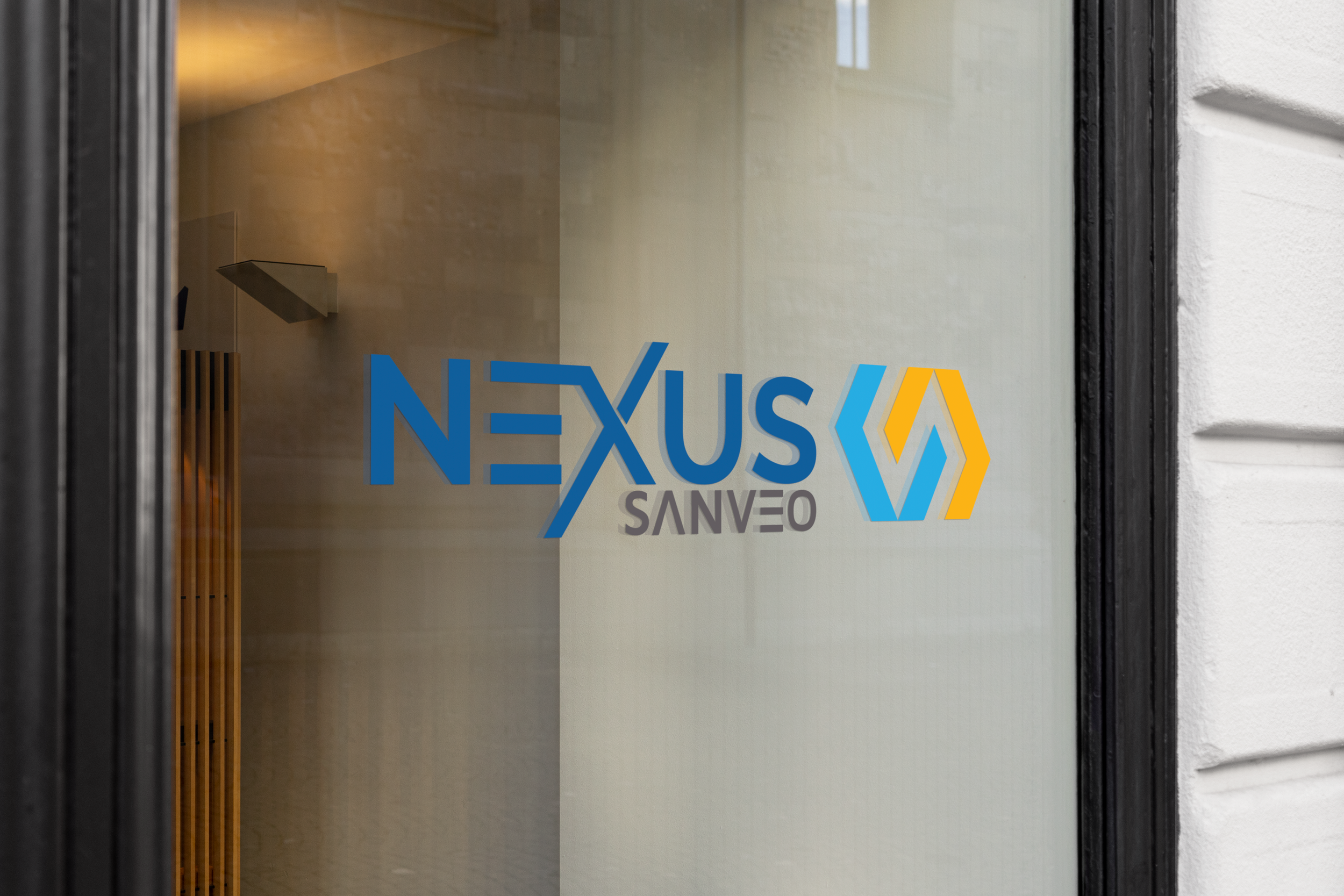
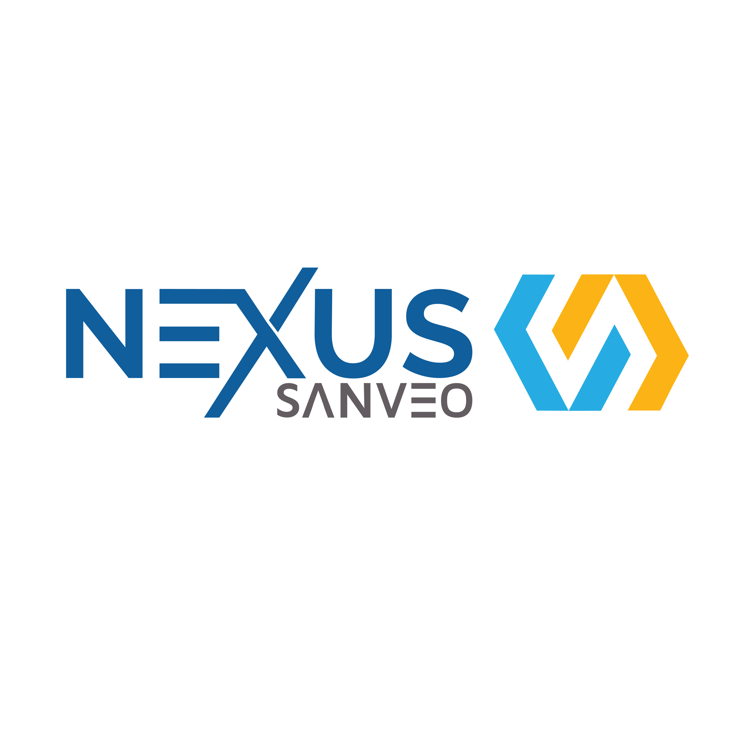
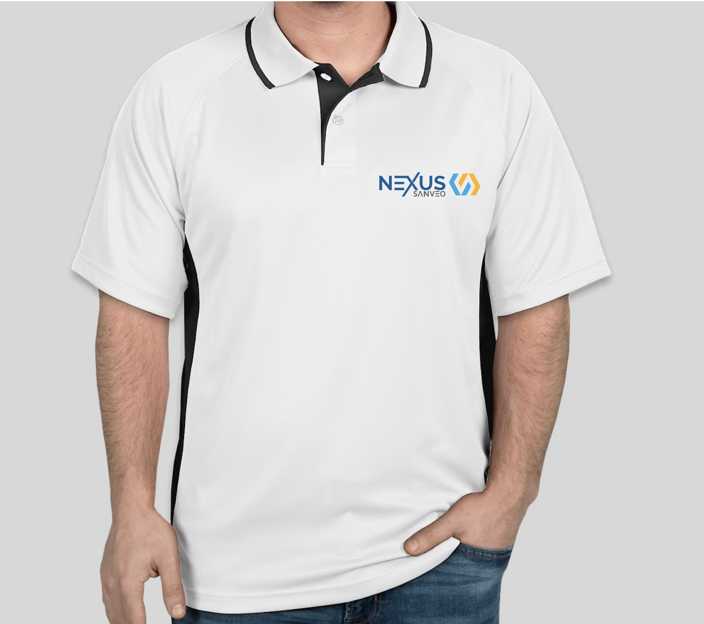
Child Brand Logo Design
Sanveo Nexus
Client:
Sanveo is a boutique construction technology consulting firm offering both implementation and advisory services to at all levels of the AEC industry. Under the trademarked banner of "Artisanal Intelligence" we are -- incrementally and diligently -- ushering in the age of robotics in construction.
Problem:
Sanveo wanted to expand their brand by creating a connected child brand—one that felt aligned with their identity while still standing on its own. After discussing their goals with the team, it became clear they wanted to retain their core colors and logo icon, using the original brand elements as a foundation. The main Sanveo name would shift into a more secondary role, allowing the new sub-brand to take the lead while maintaining a cohesive visual relationship.
Solution:
I developed several logo mockups and presented them to the VP for initial feedback. Once we aligned on a clear direction, I moved into refinement and finalization. Because the brand is technology-focused, I aimed to create a mark that felt modern, clean, and interconnected—built from simple lines and geometric shapes. By incorporating three of the four core brand colors, I was able to maintain visual consistency while still giving the child brand a distinct identity.